2009年10月12日 星期一

Typography

From the previous lesson talking about typography, I know how to identify the six different categories of types. Of the six categories, I like the Script typeface the most. Some fonts like Chopin, Snellroudhand, etc are classic and elegant. Moreover, I know that types itself are not just simply texts, but also important elements in design.

Sometimes, we may use typefaces for decorative purpose, or even use different typefaces to create graphics. The use of different typefaces in design would definitely influence the visual effect.




2009年10月10日 星期六

Little Dimples

Old song, but new combination.


There's nothing new on the song, but the new combination who sing the song produced sparkle. WOW!
(ya! There are no new ideas in communication design there are only new combinations and the synthesis of old ideas.)


Enjoy the video:)


"Little Dimples" - Original version sung by Charlene Choi and JJ Lin


"Little Dimples" - New version sung by Riney and Bam

2009年10月5日 星期一

Traditional Chinese VS Simplified Chinese

In the recent DGC lessons, I have learnt something about design history. Such as the technological improvement that change the history of design, and also how characters and letter forms are developed from cave painting, pictures, pictograms, and so forth.

Technological improvement like the invention of paper, moveable type, printing press...... all these make design and publishing more convenient. Characters and letter forms developed from pictograms are less complicated and with less strokes, these make writing more convenient. People from all over the world, from the past to current, are, always seeking for convenient.

This brings me think of the issue about whether the Traditional Chinese Characters be replaced by the Simplified Chinese Character. As with the rapid economic development of China in the recent decades, Chinese citizen started to seek for "speed". Everything should be done as quickly as it can, and as convenient as it can. Because to them, every minute =$. They should write quickly so as to prevent wastage of time. And we can hear many voices from the mainland China that request to eliminate Traditional Chinese and set Simplified Chinese as Standard Formal Chinese Characters.

However, in my point of view, simplified Chinese can never replace Traditional Chinese. Traditional Chinese are developed from pictograms gradually over a long long period. When we look at Traditional Chinese, we can see the shadow of pictograms. That is, Traditional Chinese Characters could convey pictures and meanings. Yet, for Simplified Chinese, strokes are simplified, the ability of the character to covey pictures and meanings would also be disappeared.

Traditional Chinese Character are unique characters and letterforms. When we are seeking for convenience, we should also keep the uniqueness of our precious language characters.

2009年10月2日 星期五

2009年10月1日 星期四

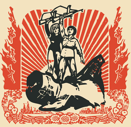
I love the Chinese Woodcut and Chinese Propaganda

Today is National day, as well as the 60th anniversary of the establishment of People Republic of China.

When it comes to China, the first person comes into my mind is Maozedong. In fact, Maozedong didn't give me a favourable impression, but those Propaganda posters about him and his ideal Communism in his era do gave me a strong impression. I love Propanganda, especially the Chinese Propaganda.


The simple add-in of the Red in Chinese Propaganda brought out strong character and thousands varieties of unique posters. They are strong, edgy, definite, stunning, outstanded.


2009年9月28日 星期一

Designing a book cover

It is the Golden Jubilee (50th anniversary) of my high school. My secondary school has published a Golden Jubilee Anthology and I have helped the school to design the book cover.

The theme of the anthology is 流金歲月(The Golden Age). Below are different versions of the cover.

When we look at an image or a picture and zoom in it, we would discover it is composed of numerous amount of dots. It is these numerous dots array coherently to create an image or a picture. Similarly, our memories are composed of numerous bits and pieces.

I try to use a number of circles that contain images of school facilities and environment to symbolize those dots, bits and pieces. As it is these facilities and the environment work together to create the golden age of my secondary school.


2009年9月26日 星期六

Turn left......or right?


This is funny.

ummmm...... Can any one tell me should I turn left or right so as to reach the MTR station?


In fact,  the sign pointing to the right is for car-users.
And the one pointing to the left is for pedestrians.
It seems that these signs are not clear enough. Misunderstanding may easily be occurred if pedestrians or car users don't know how to distinguish the differences of the two signs.