2009年11月22日 星期日

Design Ancestor

I am going to have the Design Ancestor presentation on 25/11 and I have prepared some movie posters for the presentation.


Ancestor 1:


Ancestor 2:


The Good German (2006) is a movie takes place in post-war Berlin, where to find his former mistress, an American journalist is lured into a murder mystery. It is a movie of which the visual, performance and narrative style are just as similar as the Classic Hollywood movie –Casablanca (1942).


It’s claimed that the movie, as well as the movie poster, is inspired by the movie Casablanca. And by looking at the main features of the 2 posters, we can proved that The Good German poster is really inspired by the Casablanca poster:


1. Mainly colored with red, black and white

2. Main characters occupied a larger space

3. Other characters are located beside or above main characters as background

4. Red, Script typeface for the title

5. Three names of same typeface are written at the top


Other than Casablanca, The Good German poster is also inspired by I Love Your Work(2005) poster, let's see the similarities of these two posters:


1. Mainly colored with red, black/brown and white

2. Main character occupied a larger space

3. Main character(s) are seperated from other characters through the contrast of color

4. Names are written at the top

5. Other details written at the bottom with black texts on a white background

2009年11月14日 星期六

2009年11月12日 星期四

Pepsi VS Coca-cola

From the logo revolution of Pepsi and Coca-cola from the 18th centery to now on,  we can see that logos are always keep revising. Not only because they would like to make it more beautiful, but they would also like to bring freshness to consumers. 

The same concept should also be applied to our works.
As to be a successful designer, we should always open our mind and observe things around us carefully. Keep revising our works to make it as better as it can.


2009年11月3日 星期二

home sweet home

I had nothing to do last Sunday, so I decided to capture some images of my living environment.

Photo taken at Quarry Bay Park :)


2009年10月29日 星期四

Breast Cancer


This is taken at MTR station and is the latest advertisement about Breast Cancer produced by Cancer Fund. When I saw this adv, I immediately recalled an TVC produced a few years ago, please refer to the link and have a look: http://www.admango.com/hkej/gif/cancer_b.asf

Most of you must have seen this TVC before and had a strong impression on it, especially for girls. It is a rather short commercial, but I think it is a very successful one. I admired the commercial as it conveyed the message about "be aware of Breast Cancer" by a simple, direct, and powerful approach. I also admired director's idea of using 2 alarms to replace the breasts. This have grabbed readers' attention and pay importance about the issue.

2009年10月23日 星期五

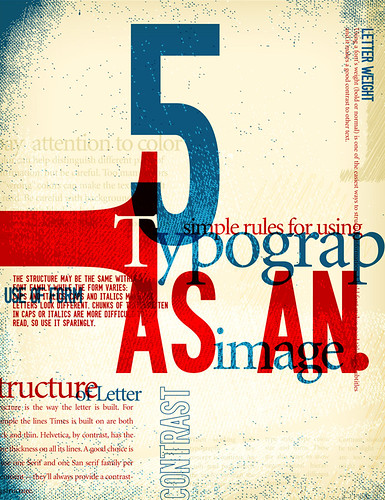
Using letterforms to create patterns

Typography is an siginificant element in design.
Recently, I have tried to use letterforms to create some patterns, below are my works.
I know my works are not good enough, but I would try to observe and study more about types, as making improvement is important in design.


Pattern of Romanticism

Pattern of Buddhism


2009年10月18日 星期日

Kan Tai Keung

I remembered a few weeks ago, we have talked about some Individual designers during lessons. I am interested in and inspired by the works of Kan Tai Keung. And, when I back home, I am eager to search more works produced by him.

Here are some works designed by Kan Tai Keung:


I really like this designer. He has good Chinese Painting skills and graphic design techniques.
Chinese Painting emphasize on verve but that on western focus on realistic. There is a big difference in these two types of arts. However, Kan is successful in combining these two types of arts together. While nowadays Chinese are strongly influenced by the western culture, Kan Tai Keung syncretize different culture and at the same time conserve the unique essence of tradition Chinese painting.

To see more works produced by Kan, you may refer to this site: http://www.kantaikeung.com/eindex.html
>>DIALOGUE-Erhard Gruettner-Kan Tai-Keung
>> Poster I /II/III/IV/V

2009年10月12日 星期一

Typography

From the previous lesson talking about typography, I know how to identify the six different categories of types. Of the six categories, I like the Script typeface the most. Some fonts like Chopin, Snellroudhand, etc are classic and elegant. Moreover, I know that types itself are not just simply texts, but also important elements in design.

Sometimes, we may use typefaces for decorative purpose, or even use different typefaces to create graphics. The use of different typefaces in design would definitely influence the visual effect.


2009年10月10日 星期六

Little Dimples

Old song, but new combination.


There's nothing new on the song, but the new combination who sing the song produced sparkle. WOW!
(ya! There are no new ideas in communication design there are only new combinations and the synthesis of old ideas.)


Enjoy the video:)


"Little Dimples" - Original version sung by Charlene Choi and JJ Lin


"Little Dimples" - New version sung by Riney and Bam

2009年10月5日 星期一

Traditional Chinese VS Simplified Chinese

In the recent DGC lessons, I have learnt something about design history. Such as the technological improvement that change the history of design, and also how characters and letter forms are developed from cave painting, pictures, pictograms, and so forth.

Technological improvement like the invention of paper, moveable type, printing press...... all these make design and publishing more convenient. Characters and letter forms developed from pictograms are less complicated and with less strokes, these make writing more convenient. People from all over the world, from the past to current, are, always seeking for convenient.

This brings me think of the issue about whether the Traditional Chinese Characters be replaced by the Simplified Chinese Character. As with the rapid economic development of China in the recent decades, Chinese citizen started to seek for "speed". Everything should be done as quickly as it can, and as convenient as it can. Because to them, every minute =$. They should write quickly so as to prevent wastage of time. And we can hear many voices from the mainland China that request to eliminate Traditional Chinese and set Simplified Chinese as Standard Formal Chinese Characters.

However, in my point of view, simplified Chinese can never replace Traditional Chinese. Traditional Chinese are developed from pictograms gradually over a long long period. When we look at Traditional Chinese, we can see the shadow of pictograms. That is, Traditional Chinese Characters could convey pictures and meanings. Yet, for Simplified Chinese, strokes are simplified, the ability of the character to covey pictures and meanings would also be disappeared.

Traditional Chinese Character are unique characters and letterforms. When we are seeking for convenience, we should also keep the uniqueness of our precious language characters.

2009年10月2日 星期五

2009年10月1日 星期四

I love the Chinese Woodcut and Chinese Propaganda

Today is National day, as well as the 60th anniversary of the establishment of People Republic of China.

When it comes to China, the first person comes into my mind is Maozedong. In fact, Maozedong didn't give me a favourable impression, but those Propaganda posters about him and his ideal Communism in his era do gave me a strong impression. I love Propanganda, especially the Chinese Propaganda.


The simple add-in of the Red in Chinese Propaganda brought out strong character and thousands varieties of unique posters. They are strong, edgy, definite, stunning, outstanded.


2009年9月28日 星期一

Designing a book cover

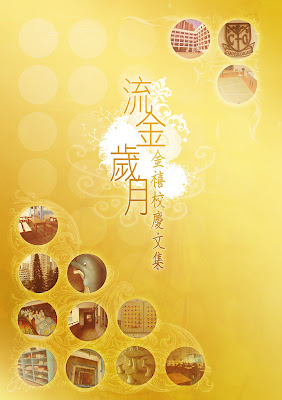
It is the Golden Jubilee (50th anniversary) of my high school. My secondary school has published a Golden Jubilee Anthology and I have helped the school to design the book cover.

The theme of the anthology is 流金歲月(The Golden Age). Below are different versions of the cover.

When we look at an image or a picture and zoom in it, we would discover it is composed of numerous amount of dots. It is these numerous dots array coherently to create an image or a picture. Similarly, our memories are composed of numerous bits and pieces.

I try to use a number of circles that contain images of school facilities and environment to symbolize those dots, bits and pieces. As it is these facilities and the environment work together to create the golden age of my secondary school.


2009年9月26日 星期六

Turn left......or right?


This is funny.

ummmm...... Can any one tell me should I turn left or right so as to reach the MTR station?


In fact,  the sign pointing to the right is for car-users.
And the one pointing to the left is for pedestrians.
It seems that these signs are not clear enough. Misunderstanding may easily be occurred if pedestrians or car users don't know how to distinguish the differences of the two signs.


2009年9月24日 星期四

First impression


I read newspaper everyday and use to pay attention to those advertisements too.

The advertisement above is abstracted from METRO NEWS.  When I took a glance over it, the first impression it gave me was - ahha..this is an DC ad.   But after I read through those tiny words, I realized it was Emirates selling its African airline. :-O

ummmm... I think this is not an good ad as it didn't gave me any idea of airline service until I have studied the whole ad.  The message it sent to me is unclear.  What's more, Emirates' logo is located in the left bottom corner and it is so small that people may not so sensitive enough to know its existence.

In my opinion, for newspaper adv, the first impression it creates for audience is no doubt important.  Not everyone would have time or interest to study the whole ad so as to figure out what products are promoting to them. First impression, thus, helps to briefly introduce the products to audience and let them to have a preview for what's going on. Besides, it may also help to grab audience's interest to study the whole ad.

2009年9月18日 星期五

What is design, actually?

From the previous DGC lessons, I have learnt that everything around us could be design. From road signs, logos, cations, notices, posters, handrails, bus routes maps...... are all about designs, as long as they try to convey meanings or communicate with audiences.

Yet, if a reader or user misunderstood or misuse something, it is the designers' fault rather than the reader or user's fault. It is the fault of the designer as he/she failed to communicate with the reader or user and direct the reader or user to do something.

On the other hand, I also learnt something about media forms and media forms are composed of different dimension. With different media forms, we can create a large pool of designs.